I love a good inspiration board. They are a great way to save mementos you love and that inspire, and they also help you hone in on an aesthetic—whether it’s for a creative project, a home decor project, or even just your personal aesthetic (daily style included!).
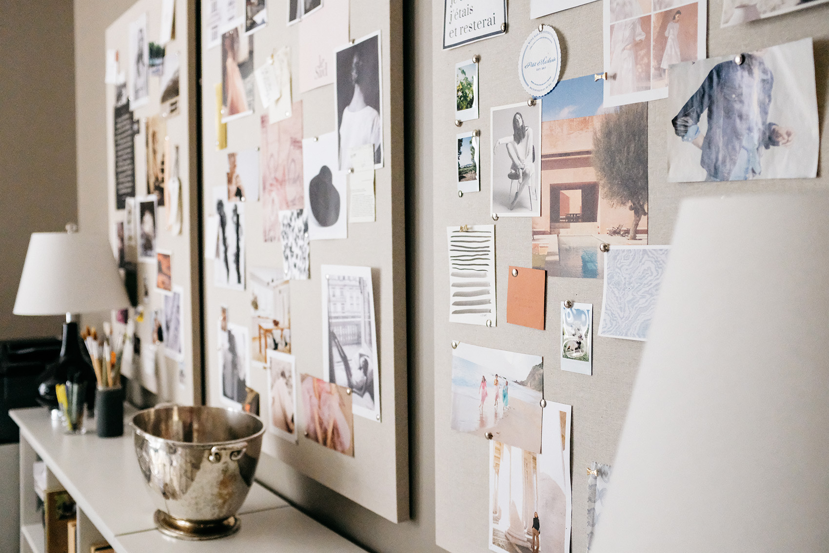
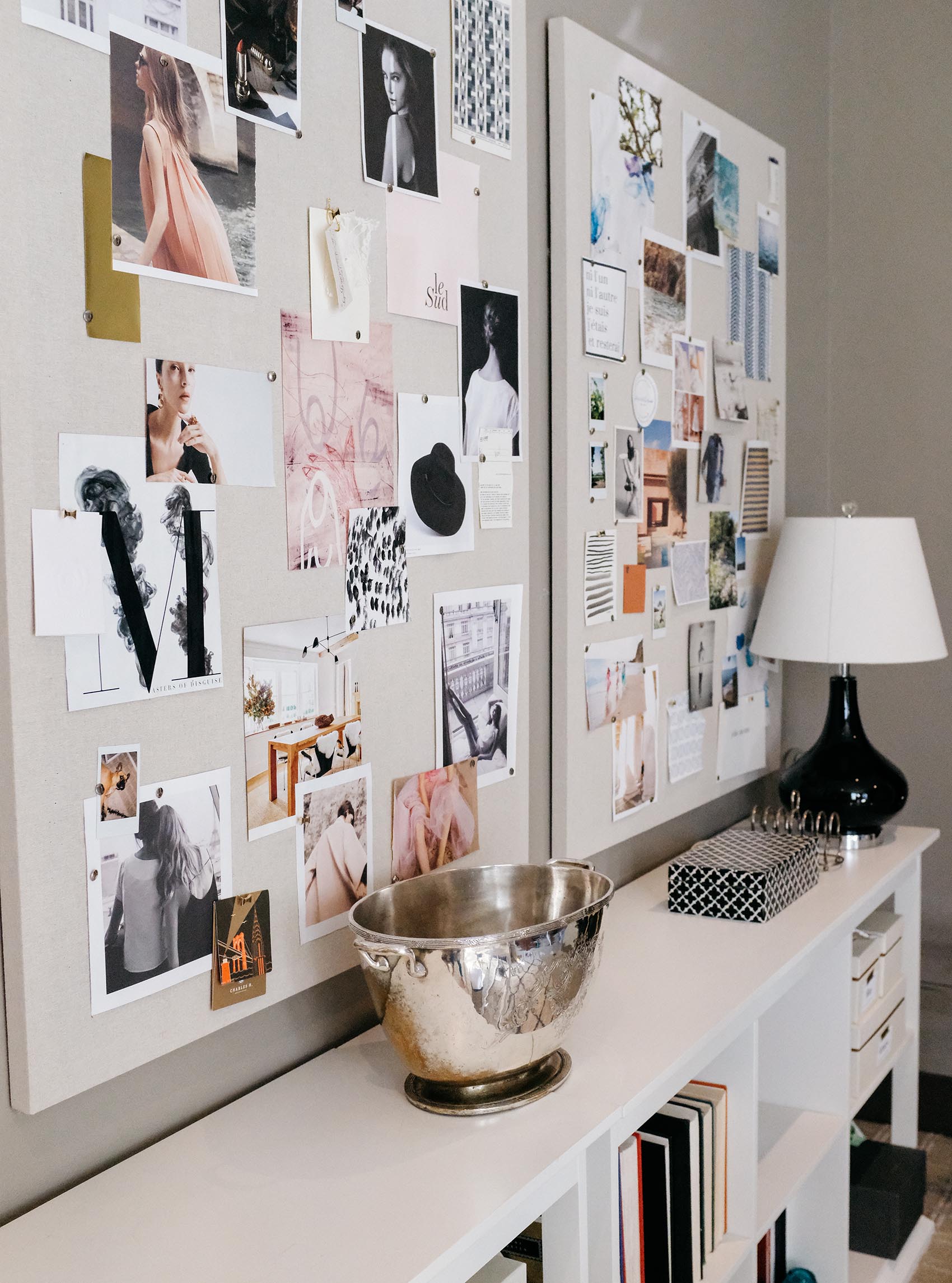
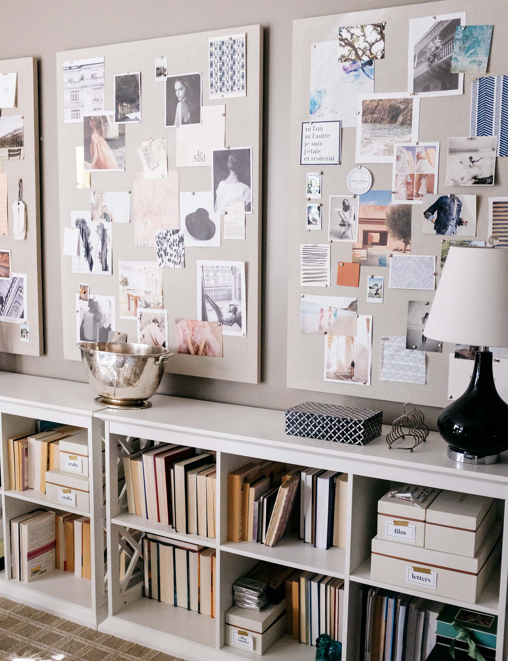
My office has one long wall featuring a triptych of three linen pinboards (these are the ones I use). While this allows me to create color or style themes on each board, you can apply the tips below to a board of any size, in any number!
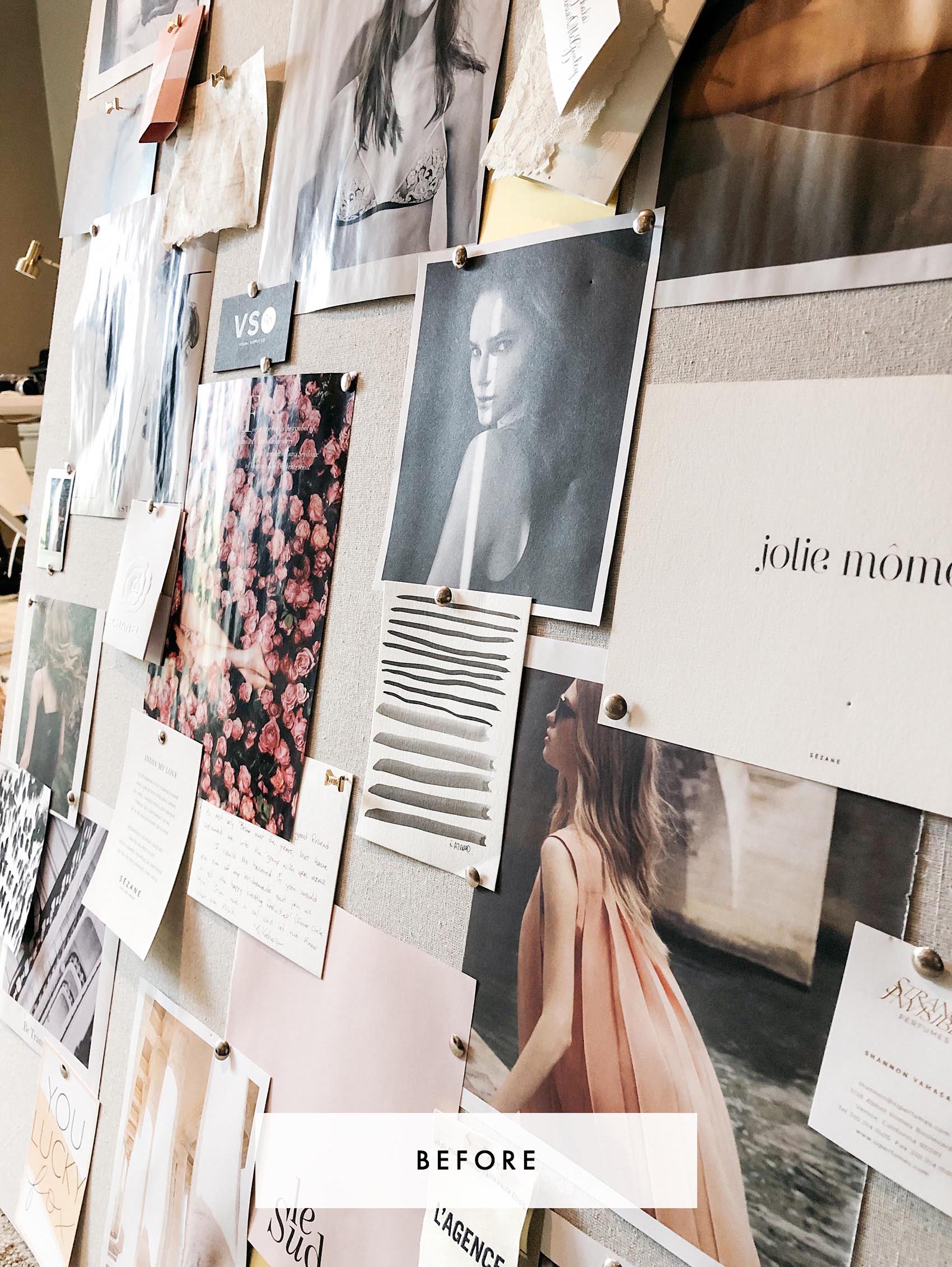
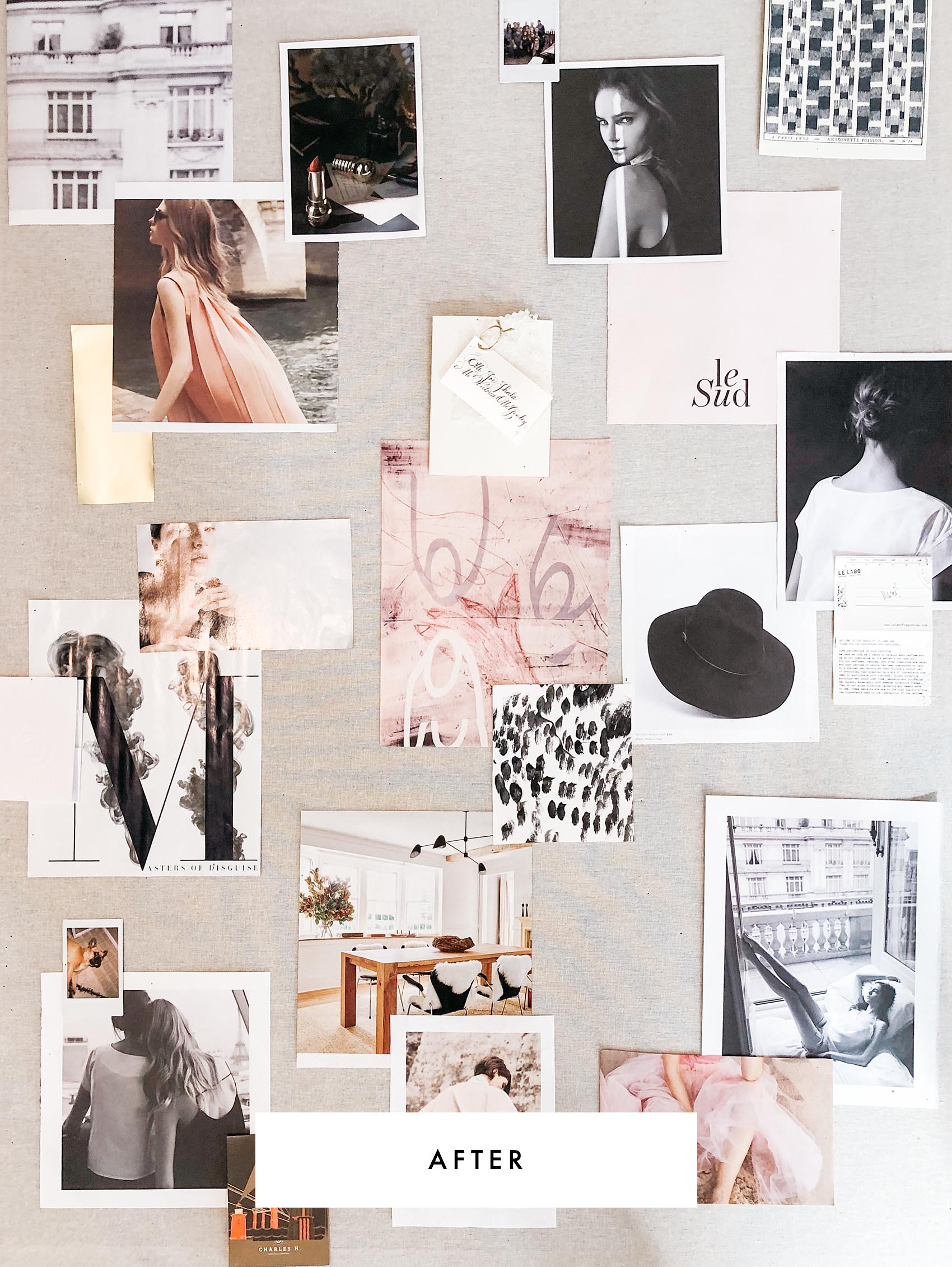
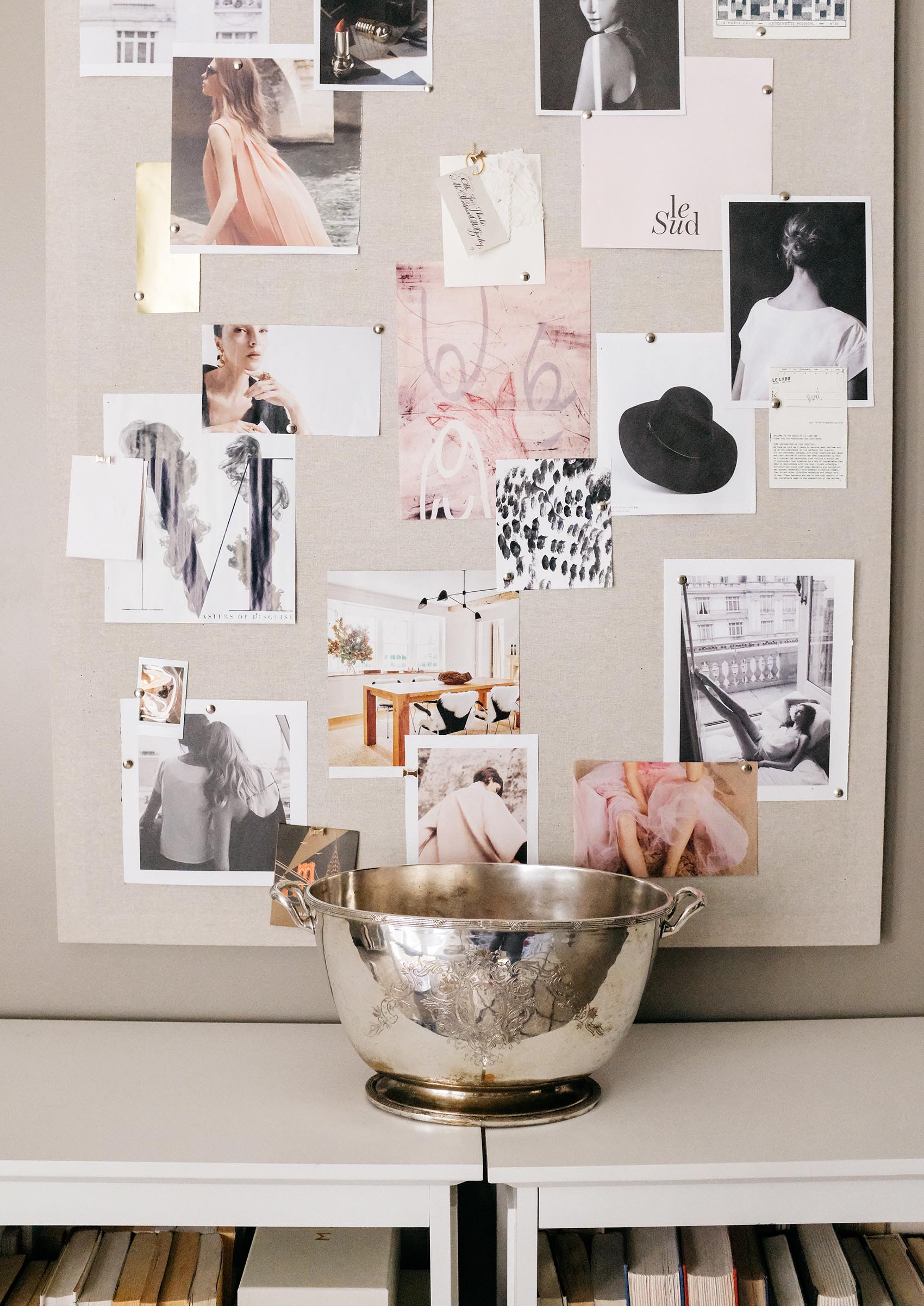
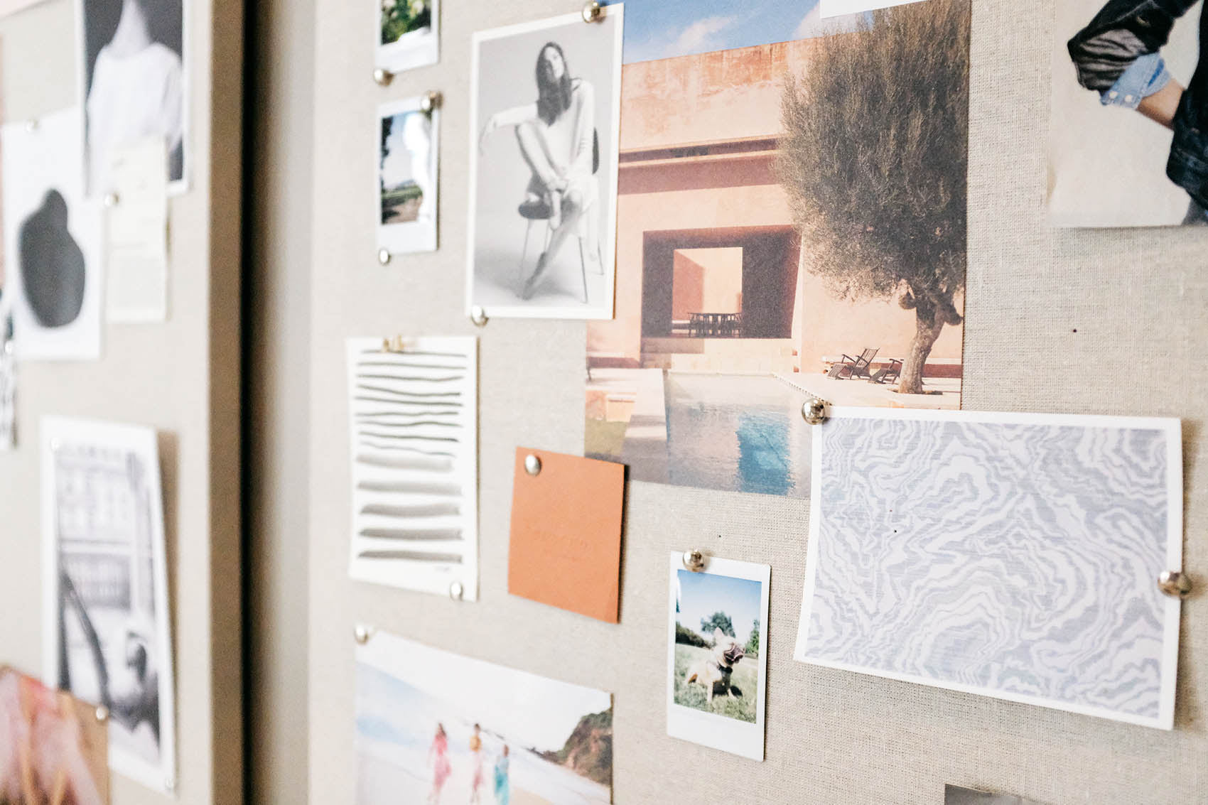
Above is a little before and after peek of one of my boards. While it still looks organized enough, it (and its sister boards!) had amassed too much stuff, and it was nice to freshen it up and leave more negative space. For this specific board, I ended up going with a similar color scheme and aesthetic feel as before, but on the right, you can see how cleaned up and fresh it is—and with plenty of room for new finds this year. Below, I’ll show you my methodology for how I structure my inspiration pinboards!
Before you begin arranging:
Hunter, gatherer. Step one: Ignore your Marie Kondo instincts for as long as you can. When it comes to gathering inspiration, save magazines, catalogs, photographs, ephemera—anything you can look through later and add to your board. If you really can’t stand the clutter, browse through the materials as you encounter them, and immediately tear out or trim any images that speak to you. Save them in a file or folder until you’re ready to play.
Think big, think small. When you’re flipping through a magazine or catalog, don’t just look at the spreads as a whole. Sometimes, small bits of pattern, or a color swatch, or even the way a model’s hands were photographed can speak to you. A mix of items small and large gives you the most cohesive look anyway (because it creates visual interest!). So, don’t stress if the items are teeny!
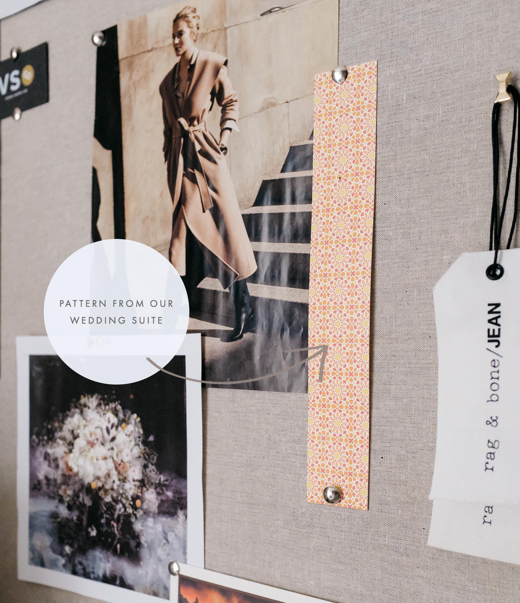
Where possible, I also recommend trimming some items with padding around them, so you have white borders on some of the subjects you trim out.
On the flip side, one thing I don’t like to feature are clipped headlines or other titles. If I mix a bunch of different titles or words together, you will likely have a bunch of different fonts that do not coordinate, and this can look messy. If I do feature items with words, I like the fonts to be from similar families or pair well together, so the vibe they communicate is similar.
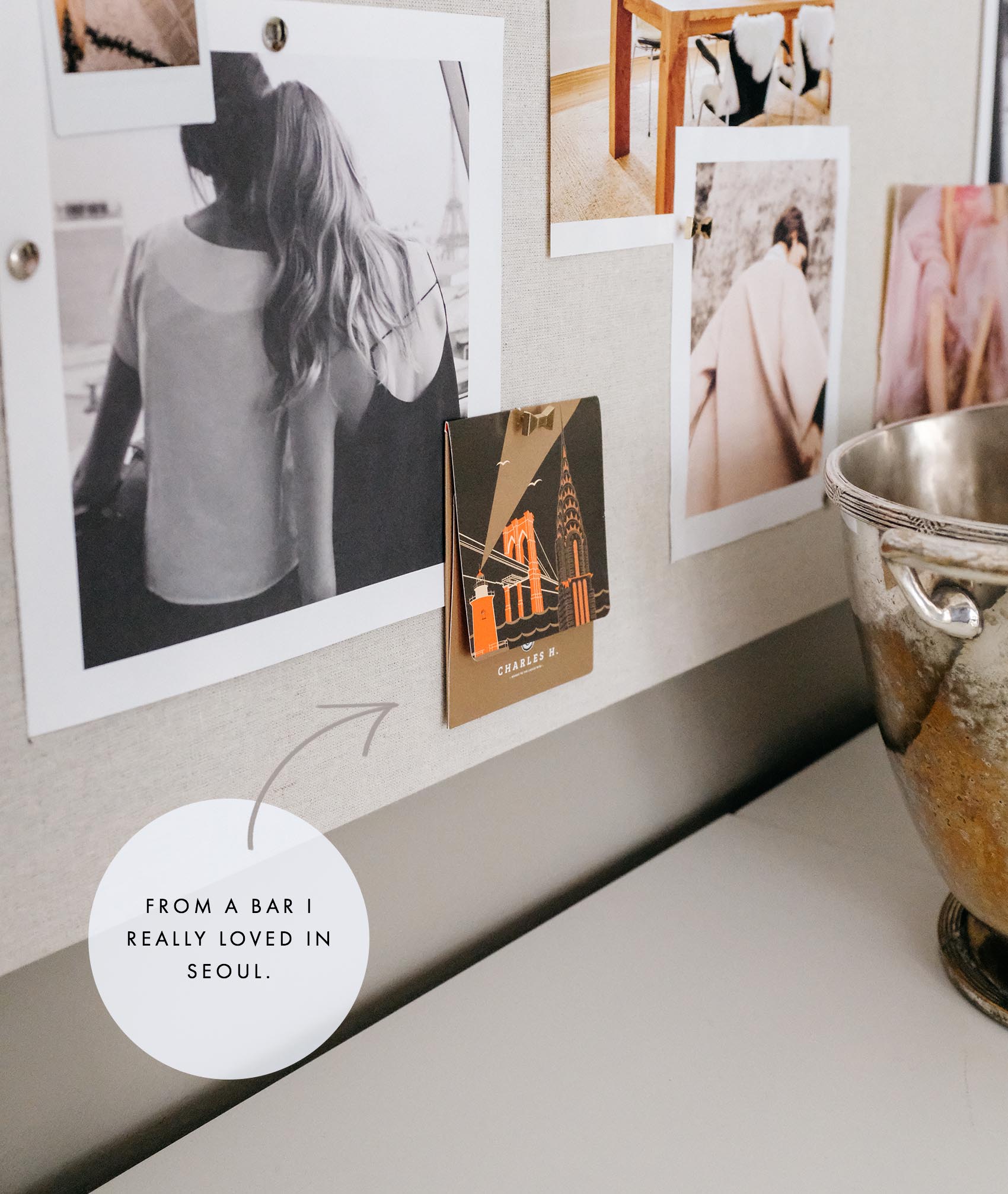
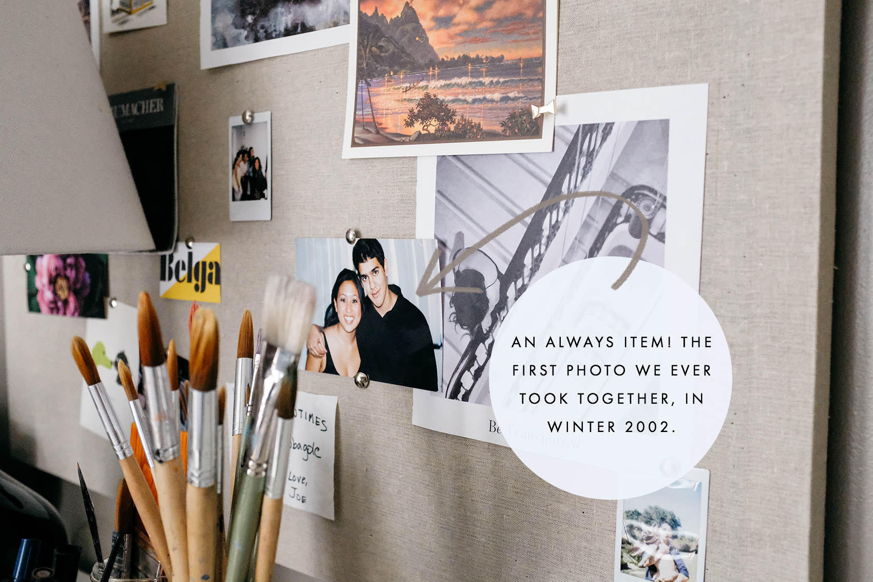
It’s the the little things. A small thank you card; a business card from a memorable meal with friends; a thank you note with your name written beautifully across the front; a fabric swatch from a craft project. Save all the little things that bring you joy or you believe to be beautiful. Bonus points for featuring items with different textures, which can make your board more interesting, too.
Ok, let’s get to arranging.
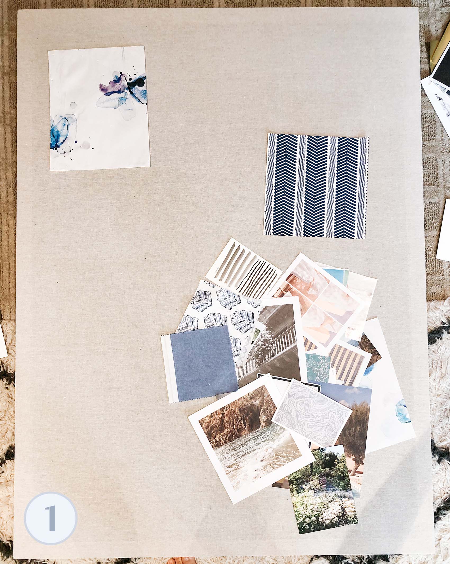
1. First, take down your current board or boards. Unpin everything, gathering the pins in a small bowl to make it easy later on. With the old and new items together, create three piles: items you definitely want to feature, items that are maybes, and things you’re ready to toss. Go off instinct here—anything that feels old or tired doesn’t need a spot in your inspiration!
As you sort, take note of patterns, colors, and the overall mood of the images you feel drawn to. Hopefully, you’ll begin to see a pattern, AND how particular items group well together. Begin setting these items aside in kind, like I did above. We’re doing this because (and this is BIG) creating a theme for your board based on color, mood, contrast, etc. will make the board visually cohesive. This approach will make your board look better than pinning up a random mishmash of items that don’t relate to one another, beyond the fact that you liked them.
2. Begin arranging! If you have a clear vision for your board, dive right in. I like to grab a bunch of items that speak to me as a “group” and lay down the largest item first, to anchor a vignette around it.
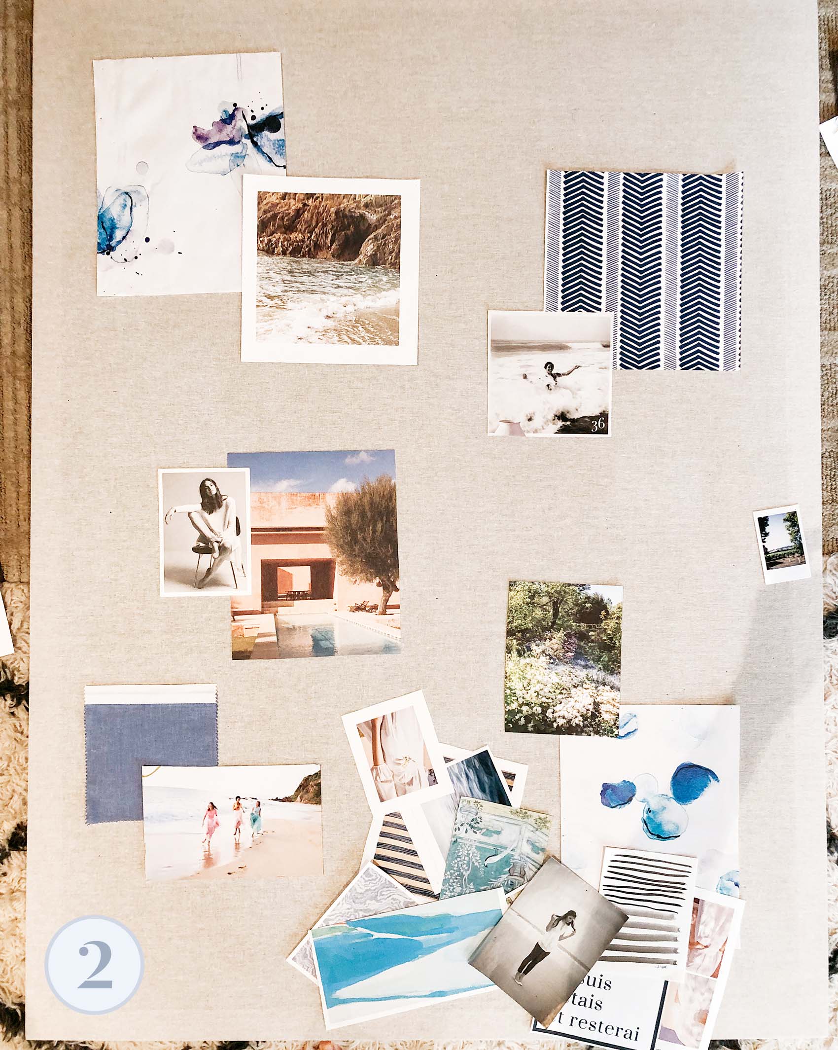
Big tip: My style is to keep the lines clean and arrange pieces parallel to the edges of the board. I don’t like arranging things on an angle, as this contributes to a haphazard feeling. Arrange, rinse, and repeat. In the #2 photo above, you can kind of see how I picked three larger pieces (the watercolor, the herringbone pattern, and the desert scene) and used them as visual anchors to other items laid on top.
As you begin laying the board’s items down, you may find it helpful to re-sort all the materials by size—larger items, smaller, and then personal effects. In addition to color, composition, and contrast, size is a great starting point for what items will pair well together.
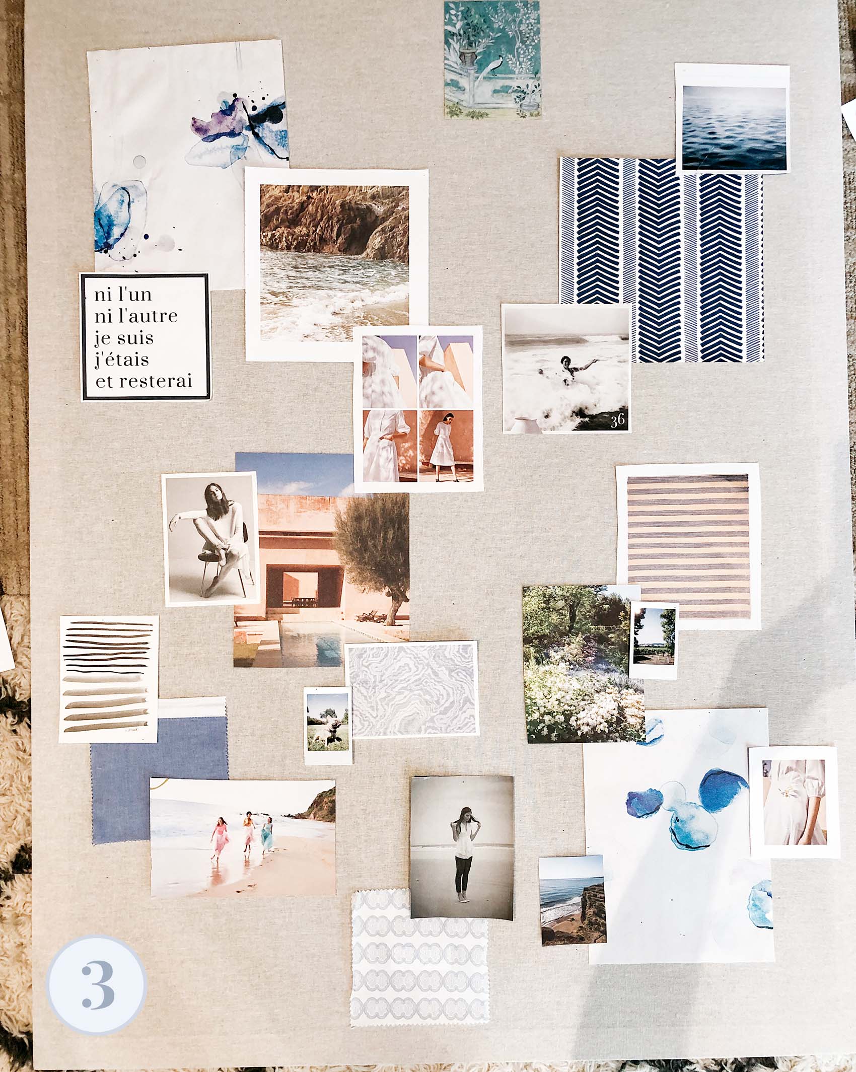
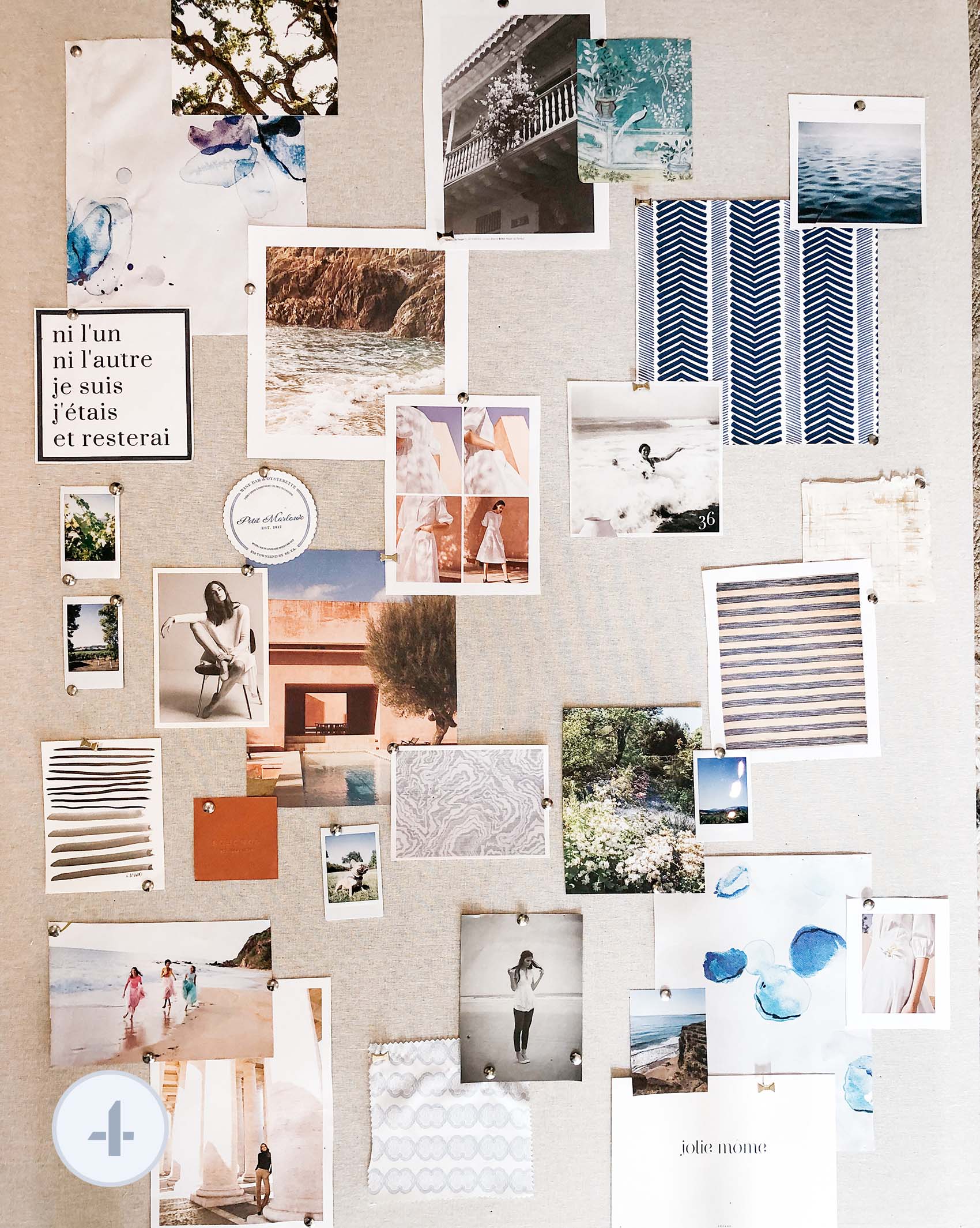
3. Have fun and play! Move the items around the board, and think about how different elements relate to one another. For this particular board, I was pursuing a theme which blended soft, water-inspired vibes with botanical elements, and really creamy, warm tones. I wanted the overall effect to feel a little more colorful, but airy and fresh. You can see how between shots 3 and 4, I removed some elements and added others.
4. Hold off on pinning…for now. I don’t pin anything down until I’m 95% happy with the overall composition. Save yourself the annoyance (and extra holes) of pinning and re-pinning things. Get the collage as you like it—or at least 95% of the way there—then attach everything.
Sometimes, once I’m “done” with a board and pull it up off the ground, I realize there’s a naked spot, or an element I don’t like, so I’ll tweak a little. Usually this means adding in small items, like polaroids or business cards. Often, it’s these tiny pieces that pull a vignette together anyway!
And hey, this isn’t brain surgery, so don’t be tough on yourself as you play. As you’re building and mixing and matching, don’t force it. If something ends up not working—even if it’s an item you really love—pull it aside and use it elsewhere. You can always take something down if you don’t like it in the long run. No big deal!
* * * *
So in addition to editorial inspiration, I love that these boards are a place to store keepsakes and mementos that would otherwise end up in a drawer…or the trash. Here are just a few of mine:
It’s cool for me to look at these boards now and compare to my “before” shots. It makes me realize how many fun things I’ve collected since I last organized them, and more importantly, how much your own taste and eye can evolve (or stay the same!). There are items on some of these boards that I’ve had pinned up for over 8 years! And some, which I thought I’d relate to forever, got the boot this time around, only to make way for new snapshots or images I was surprised I liked.
So give it a try! Whether your inspiration board is big or small (or is simply your refrigerator!), I hope this gave you a couple ideas for how you can approach designing it.

So pretty and great tips! I like when you create digital ones for the blog, too.
Thanks, Jane! :)
I keep returning to his post and finally got my own. So excited to try my hand. Love your aesthetic!
Where can I find a board like yours? I love how neutral it is!
Can you share the brand of the white bookcases with the dividing cubes? Thank you.
I bought them many years ago online! I don’t know if the exact one is still available (ours had a back to it and are pure white), but here are similar: https://www.hayneedle.com/search/index.cfm?Ntt=hampton%20console
Love your inspo photos! What kinds of magazines do you usually have on hand, to find these kinds of clippings?