

Many folks don’t know this unless you’ve read my blog for a very long time, but it actually started out as a food blog. After I graduated from college, I went to culinary school; following that, for a short time I worked as a freelance food writer, which is also around the time I started blogging. When I was freelancing, I worked in the San Francisco Chronicle‘s test kitchen, writing and testing recipes, styling shoots, and working in the wine cellar. It was a fun, interesting time in my life that sometimes feels like a million years ago! But those experiences in my early 20s were really formative, and oddly enough, sent me down the path that led me to where I am now, working as a web designer (it’s funny how life works out).
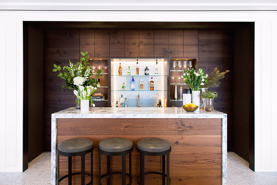
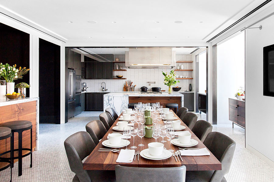
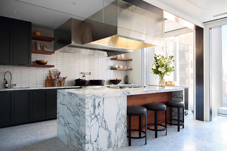
Anyway, this less a post about my wild career history, and more about test kitchens. I always considered the Chronicle test kitchen to be pretty decent — multiple stoves and refrigerators, more cookware and styling pieces than you would ever know what to do with, and of course, a professional studio for taking all those pictures. Earlier this year though, when I got a glimpse of the new Bon Appétit test kitchen in the One World Trade Center offices in Architectural Digest, my 23-year old self was immediately jealous. Have you seen this place? Well, technically most of the magazine’s test work is done in a much larger, still beautiful, industrial kitchen, of which there is a fantastic tour here. But there is also a separate private kitchen, used for events and probably photoshoots, that’s absolutely stunning. Both kitchens are high up in the building, meaning the natural light that floods in through the windows is insane — and if you’ve ever taken a photo, like, ever, you know that natural light is a very good thing.
I love how modern and clean they went with the private kitchen. Simple but impactful touches like the waterfall counters on both the bar and island make the space feel special and luxe, and the grid tiling on the backsplash lends a clean, modern feel. Meanwhile, while classic elements like hex floor tiles and wood paneling bring on the organic elegance. It’s neither too masculine or too feminine, and again — that light! Oh to be able to work in such a space all day! Even though it is in a corporate setting, it’s the kind of kitchen that could inspire any homeowner, don’t you think? What’s your favorite feature in the space?
If you’re interested in seeing more photos of the private kitchen space, check out Architectural Digest‘s tour here; you can also read more about the test kitchen and what it’s like to work in one over at The New York Times. It’s interesting to contrast how the BA test kitchen works versus a local newspaper’s…instead of having someone order products for us from FreshDirect, we used to go to Whole Foods nearly daily, and lug all the bags back on foot. Pre-Uber days for sure!


What I would do to have a kitchen like that! The natural light is killing me…
I also love the light in this space! But what I mostly like is the combination of brown with that white. It gives elegance to a large space;I would give the place a stronger cosy feel though, maybe with a rug.
I love Sukhi for our wool rugs from Morocco especially and I believe one of these would fit lovely in this kitchen. Have a look at http://www.sukhirugs.com/morocco.html. We work directly with artisans and make sure everyone knows the origin of their rug